You definitely played the logo game at some point in your life, I know I’m guilty of that. And I know for a fact, that when you saw the trefoil or the swoosh, you just knew. But to each of the sneaker logos we know and love, there’s more than meets the eye. Each of these stories is pretty interesting in its own way. So let’s check out all the sneaker logos stories and you can decide what your favorite is!
Sneaker Logos Hit Differently When You Know!
Nike’s Swoosh
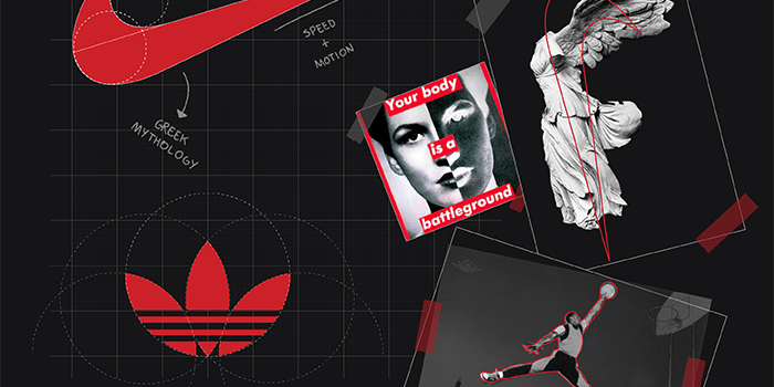
You would think that a logo for a huge sneaker giant like Nike would cost a lot, right? Wrong! The OG Nike Swoosh actually cost the company $35 only back in 1971. The designer, Carolyn Davidson aimed to make the logo look like Nike the goddess of victory’s wing. One of the goddess’ powers is speed, and the swoosh is the “sound” of speed. Don’t feel bad for the designer though, she owns shares in the company now, and a diamond swoosh ring!

Although we’re discussing sneaker logos, we can’t pass by Nike and not discuss its slogan. “Just Do It”… I mean, it was a fantastic phrase until we discovered where it came from. According to Nike’s advertising company, the inspiration behind the phrase is actually a criminal. Gary Gilmore’s last words “Let’s do it” before his execution. Pretty grim, amirite?
Adidas – Sneaker Logos Get… Confusing?
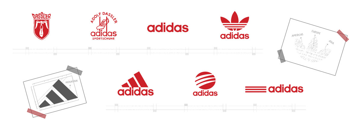
Next up, we have the three stripes! Or the trefoil? Who knows? Well, we do, but we wanted to be a bit dramatic. First of all, Adidas has multiple logos that are all pretty much active to this day. The first logo is the classic trefoil that represents the three landmasses America, Europe/Africa, and Asia. In other words, it shows the diversity and that Adidas is for everyone.

But you can’t have a 3-stripes company without actual three stripes, right? That’s why the next logo is as iconic as the first. The mountain-like inclined 3-stripes represent the obstacles that athletes face and overcome. Who knew simple sneaker logos could hit so deep… Anyway, the latest addition to Adidas logos is a simple wordmark with 3 horizontal stripes. This one is obviously meant to be timeless and stay for a long time.
PS: If you didn’t know it, Adidas is simply a mashup of the founder’s name: Adolf “Adi” Dassler.
Puma
We had to put Puma up next because we can’t discuss one Dassler brother without the other, can we? Ironically, the company was gonna be called Ruda (Rudolf Dassler, duh) but then Rudolf went for Puma. His inspiration was the Puma cat, and he wanted his products to reflect the same qualities: speed, strength, agility, and more. The logo began as a puma cat leaping through a capital D, for Dassler. The design then evolved to become today’s text that we know, with the leaping cat.

Fun fact: The designer of the logo, cartoonist Lutz Backes, was offered a commission for every item sold with his logo design. Instead, he chose to receive a one-time payment, sneakers, and a sports bag.
Air Jordan – The Best Sneaker Logos Are the Simplest!
We know you don’t need an introduction to this specific logo, but we might as well! You know you’re a successful athlete and human when your name becomes a brand. And that’s exactly what happened with Michael Jordan. The first logo that we know and love on the first two Air Jordan silhouettes is a basketball with wings. Straight to the point and efficient.

However, it’s not nearly as iconic as the mighty Jumpman. The logo first appeared on the AJ3, and is still here today on every apparel item and pair of kicks! Moreover, the origin of the logo is pretty interesting, despite the fact that Tinker Hatfield designed it in 1988. He designed it based on a photograph though. And that picture is the source of all the debate!
So the initial picture was by Life magazine, of Jordan soaring through the air. When Peter Moore and the team saw the picture, they wanted to use it, but you know… copyrights. So they went on and recreated the pics, and the Jumpman was born.
PS: Speaking of the Jordan logo, the Jordan 1 Prototype is dropping soon. Read this to find out why you gotta get over your love for logos with that pair!
Reebok
So you probably already heard, but Adidas sold Reebok for $2.5 Billion! Anyway, the UK-original US-based brand Reebok has a pretty simple logo history. It all started with a Union Jack flag logo, and it evolved from there! The logo went through several redesigns, but our favorite so far is the current two stripes with the third across. The red delta logo also represents the physical, mental, and social transformations equally.

Asics
No, as opposed to what teenage me thought, the designers didn’t put a reversed “B” on the logo. It’s actually an A for Asics, naturally. Interestingly enough, Asics is an acronym for the Latin phrase: Anima Sana In Corpore Sano. The phrase means “a sound mind in a sound body”. And honestly, this is the deepest story among all the sneaker logos and names so far.

Ironically, before becoming Asics, the sneaker brand’s name was Onitsuka after the company’s founder. However, the Latin phrase made such an impression on him that he changed the whole brand! And if you’re wondering what the side stripes mean, we gotchu. It was a simple in-house design competition where the Mexico stripes won!
Vans – Why Fix Sneaker Logos That Ain’t Broken?
One of the most consistent sneaker logos so far on our list. Why? Because it barely changed since 1966! When they see the extended “V”, everybody just knows that we’re about to see some kicks. However, one variation became almost as iconic as the original design. The skateboard with Vans “off the wall” inside is a direct nod to the brand’s skateboarding origins.

Converse
This one is pretty interesting. So, Converse is one of the brands that didn’t really have a constant logo until they dropped the All-Star silhouette. The kicks were so popular that the brand adopted the star and included it in all of their logos since 1962. I mean, we all know that beauty is in simplicity, and Converse definitely went for that!

New Balance
Last but not least, another consistent design by New Balance. We wouldn’t miss the brand after all the crazy collabs they’re throwing our way! The N and B merge beautifully with stripes on the N to represent speed. And since 1972, the brand kept the same logo with minor iterations.

Honorary Mention: Supreme
Not a sneaker brand, but we can’t talk logos and not discuss a controversial yet iconic logo like this. And Supreme is famous for some of the best sneaker collabs around! So the story behind this logo is pretty cool, especially that it involves a rip-off. The bold Futura Oblique font and red box are actually the trademark style of the artist Barbara Kruger. Kruger is a rebellious artist and definitely supports anti-capitalism. This is kinda ironic considering what Supreme New York is, right? You can actually read more about this right here!

The Best Sneaker Logos Always Tell a Story
Now that you know all the cool stories behind the most famous sneaker logos, you know why we love them so much. So the next time you go sneaker shopping, you’ll know exactly the heritage and story behind each of them! Just make sure that you have a sneaker bot in hand when you want to buy from the sneaker giants. After all, with great hype comes great demand! Godspeed 🔥


